Cambria alternatives. Closest free font by our measurements: Noto Serif, score 85.
Noto Serif (85) edges out Frank Ruhl Libre (81) as the free font nearest Cambria; STIX Two Text comes third at 80 of the 24 we measured.
6 / 6
Score 85 · closest by measurements
Noto Serif
Sphinx of black quartz, judge my vow
Loading font…
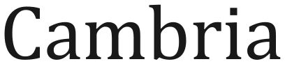
Cambria

Against Cambria: x-height 15% taller, 13% wider, 0.8% heavier, and 23% less stroke contrast.
Letters that differ most from Cambria: C, s, and j.
Styles: 9 weights, with italics.
- ✓Web
- ✓Logo
- ✓Selling
- OFL 1.1
Caladea keeps Cambria’s character widths, and so its line breaks, at score 72.
Which Cambria alternative to pick
Take STIX Two Text for Cambria when restrained measured differences matter: it is 1.5% narrower, 2% darker and has 0.5% more stroke contrast, with 4 weights and italics. Noto Serif scores higher at 85 against Cambria and provides 9 weights, while Caladea has the same character widths as Cambria for documents that must keep their line breaks. A j is among the letters that differ most from Cambria in five of the six rows; Caladea’s are z, C and f. STIX Two Text is the only pick the lab gives no label against Cambria, and Noto Serif and Taviraj both come in 9 weights with italics for Cambria work.
Where Noto Serif and Cambria differ
01 / Where the difference shows
C, s, and j: Noto Serif parts from Cambria most here
Noto Serif keeps Cambria’s weight within 0.8%; the widest gap is 23% less stroke contrast.
The lab labels Noto Serif against Cambria: x-height 15% taller, 13% wider, and less stroke contrast.
- x-height+15%
- Width+13%
- Weight+0.8%
- Contrast−23%
Every free font measured against Cambria
| Free font | Score | x-height | Width | Weight | Contrast | Letters that differ |
|---|---|---|---|---|---|---|
| Noto Serif | 85 | +15% | +13% | +0.8% | −23% | C s j |
| Frank Ruhl Libre | 81 | +0.3% | +1% | −3.2% | +22% | 8 j c |
| STIX Two Text | 80 | +1.3% | −1.5% | +2% | +0.5% | 8 c j |
| Taviraj | 79 | +0.7% | +8% | −4.4% | −0.3% | i j f |
| Gupter | 79 | −3.2% | −11% | −5.1% | −5.6% | z j 5 |
| Inria Serif | 78 | +6% | +7.4% | −14% | +18% | s 2 4 |
| Erode | 77 | −4% | −4.3% | −15% | −22% | r O Q |
| Poly | 76 | +1.3% | +3.7% | +9.3% | −24% | e 5 i |
| Półtawski Nowy | 76 | −5.3% | +4.5% | +12% | none recorded | y w I |
| Gambetta | 74 | −3.2% | +3.5% | −17% | +2.8% | j 8 i |
| Kameron | 73 | −6.4% | +6.2% | 0% | −30% | g Q q |
| Tinos | 73 | −1.7% | −5.9% | −0.5% | −5.4% | d i r |
| Caladea | 72 | 0% | −4.3% | +7.1% | −19% | z C f |
| Halant | 72 | +8% | −1.7% | −18% | −19% | C j i |
| Charis SIL | 72 | +3.2% | +2.6% | +7.9% | −3.3% | d i j |
| Roboto Serif | 71 | +8.8% | +14% | +2% | −31% | O d j |
| Unna | 71 | −10% | −6.6% | +3% | +41% | 8 j f |
| Sentient | 70 | +7.5% | +13% | +4.2% | −4.8% | j i 8 |
| Literata | 70 | +8.6% | +14% | +7.4% | −30% | c J S |
| Bentinck | 70 | +7.1% | +11% | −11% | +76% | 8 g j |
| Gelasio | 69 | +4% | +2.3% | +7.3% | −5.4% | 4 J j |
| Gilda Display | 69 | +1.3% | +3.9% | −20% | +59% | 7 6 c |
| BIZ UDMincho | 69 | +16% | +2.5% | −23% | −37% | j W f |
| Hausschrift | 68 | −7.2% | +0.1% | −2.2% | +32% | 8 j 3 |
Cambria or Georgia
Against Georgia, Cambria measures 2.2% narrower and 5.3% lighter, with an x-height 3% shorter and 12% less stroke contrast, going by the 10 free fonts the lab set beside both. Caladea is drawn to Cambria’s widths, so Cambria documents keep their line breaks in it, while Gelasio, drawn to Georgia’s, runs 2.3% wider than Cambria. Noto Serif, the closest to Cambria at 85, drops to 71 against Georgia. A document set in Cambria belongs on this page.
Can I use these Cambria alternatives for…
| Free font | Web | App | Logo | Selling | Commercial | |
|---|---|---|---|---|---|---|
| Noto Serif | ✓ | !* | ✓ | ✓ | ✓ | ✓ |
| Frank Ruhl Libre | ✓ | !* | ✓ | ✓ | ✓ | ✓ |
| STIX Two Text | ✓ | !* | ✓ | ✓ | ✓ | ✓ |
- * Noto Serif, Frank Ruhl Libre, and STIX Two Text, Cambria alternatives inside an app: include the copyright notice and licence with the font files.
- OFL 1.1 text
- Full conditions for Cambria alternatives
Cambria alternatives: questions
What is the closest free alternative to Cambria?
Noto Serif scores 85 against Cambria, ahead of Frank Ruhl Libre (81) and STIX Two Text (80) among 24 free fonts.
Which free font keeps Cambria’s line breaks?
Caladea, drawn to Cambria’s widths, so documents keep their lines and pages; it scores 72, with 19% less stroke contrast the largest gap against Cambria.
How does Frank Ruhl Libre differ from Cambria?
Frank Ruhl Libre scores 81 against Cambria: x-height 0.3% taller, 1% wider, 3.2% lighter, and 22% more stroke contrast. Its 8, j, and c differ most from Cambria’s.
Which Cambria alternative has the most weights?
Noto Serif has the most of the Cambria picks here, 9 weights and italics; Taviraj has 9 weights, Frank Ruhl Libre has 7 weights, and STIX Two Text has 4 weights.
Can I use the Cambria alternatives commercially?
Yes, all 6 free alternatives to Cambria here allow commercial work.
Is Cambria an open font?
No. Cambria ships with Windows 11.
Paid fonts that share free alternatives with Cambria
- Times New Roman → Sneaky TimesShares STIX Two Text with Cambria. Times New Roman against Cambria: x-height 4.2% shorter, 5.9% narrower, 0.6% lighter, and 14% more stroke contrast.score 96
- Sitka → Erode8 free fonts measured against both, none among the closest to Cambria. Sitka against Cambria: x-height 2.4% taller, 8.9% wider, 0.5% heavier, and 16% less stroke contrast.score 83
About Cambria
Jelle Bosma, Steve Matteson and Robin Nicholas designed Cambria for Microsoft in 2005, a transitional serif. Of the platform lists we checked, Windows 11’s carries Cambria.
Besides Cambria, Steve Matteson designed Segoe UI and Ink Free.
Besides Cambria, Robin Nicholas designed Arial.
Cambria is a font by Microsoft; FontForThat is not affiliated with Microsoft; this is an independent comparison.