Corbel alternatives. Closest free font by our measurements: Paysage, score 83.
Paysage (83) edges out Maven Pro (81) as the free font nearest Corbel; Cantarell comes third at 80 of the 24 we measured.
5 / 5
Score 83 · closest by measurements
Paysage
Sphinx of black quartz, judge my vow
Loading font…
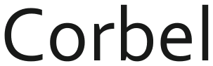
Corbel

Against Corbel: x-height 0.8% shorter, 5.4% wider, 0.4% heavier, and 7.7% less stroke contrast.
Letters that differ most from Corbel: g, t, and O.
Styles: 4 weights, no italics.
- ✓Web
- ✓Logo
- ✓Selling
- OFL 1.1
3 of the 24 reach 80 against Corbel.
Which Corbel alternative to pick
Start with Paysage for Corbel if measured similarity matters most: it scores 83 and has ink 0.4% darker across 4 weights. Tajawal offers 7 weights for Corbel work that needs a larger family, but its ink is 12% lighter; Cantarell has italics and 2 weights, with letters 10% wider than Corbel.
Where Paysage and Corbel differ
01 / Where the difference shows
g, t, and O: Paysage parts from Corbel most here
Paysage keeps Corbel’s weight within 0.4%; the widest gap is 7.7% less stroke contrast.
The lab labels Paysage against Corbel: 5% wider.
- x-height−0.8%
- Width+5.4%
- Weight+0.4%
- Contrast−7.7%
Every free font measured against Corbel
| Free font | Score | x-height | Width | Weight | Contrast | Letters that differ |
|---|---|---|---|---|---|---|
| Paysage | 83 | −0.8% | +5.4% | +0.4% | −7.7% | g t O |
| Maven Pro | 81 | +7.6% | +9.5% | −12% | −11% | O 1 n |
| Cantarell | 80 | +4% | +10% | −5.7% | −6.8% | Q 5 2 |
| Tajawal | 79 | −2.1% | −0.1% | −12% | +7.7% | S 1 5 |
| Plein | 78 | +9.1% | +7.1% | −3.3% | +4.9% | g 1 i |
| Author | 77 | −4.5% | −6.1% | −9.2% | −5.6% | g j Q |
| Cambay | 77 | +3.5% | +4.8% | +0.4% | +4.2% | l Q u |
| Skeena Indigenous | 76 | −0.4% | −0.4% | +6.5% | +25% | g u O |
| Amiko | 76 | +13% | +20% | −1.8% | +2.4% | 0 u i |
| Ysabeau SC | 76 | +0.5% | +10% | −24% | +16% | Q M S |
| Mukta | 75 | +1.3% | +0.7% | +12% | +10% | g j 1 |
| Garcia | 74 | −0.8% | +6.3% | +1.7% | −14% | g Q l |
| Blinker | 73 | +6.5% | +1.5% | +5.1% | −11% | O 1 b |
| Prompt | 73 | +3.5% | +18% | +16% | +4.8% | 1 4 2 |
| Alpino | 72 | −14% | −8.7% | +12% | +1.2% | g u h |
| CMU Sans Serif | 72 | −4.1% | −2.2% | +2.6% | +1.5% | g Q u |
| Molengo | 71 | −1.3% | +0.2% | +3.8% | +2.4% | j g i |
| Varela | 71 | +9.9% | +15% | +6.4% | −11% | t 4 Q |
| CMU Bright | 71 | +1.7% | −1% | −18% | +2.3% | Q 2 5 |
| Gudea | 71 | +8% | +0.8% | −6.2% | −5.9% | u Q 0 |
| Catamaran | 71 | +7.4% | −1.5% | +1.8% | −2.4% | Q u z |
| Padauk | 70 | −6.3% | −3.6% | +7.5% | +19% | C O t |
| Actor | 70 | +8.4% | +2.7% | +3.1% | −1.1% | u Q j |
| TASA Explorer | 70 | +7.8% | +13% | +2.1% | +4.2% | 9 5 1 |
Can I use these Corbel alternatives for…
| Free font | Web | App | Logo | Selling | Commercial | |
|---|---|---|---|---|---|---|
| Paysage | ✓ | !* | ✓ | ✓ | ✓ | ✓ |
| Maven Pro | ✓ | !* | ✓ | ✓ | ✓ | ✓ |
| Cantarell | ✓ | !* | ✓ | ✓ | ✓ | ✓ |
- * Paysage, Maven Pro, and Cantarell, Corbel alternatives inside an app: include the copyright notice and licence with the font files.
- OFL 1.1 text
- Full conditions for Corbel alternatives
Corbel alternatives: questions
What is the closest free alternative to Corbel?
Paysage scores 83 against Corbel, ahead of Maven Pro (81) and Cantarell (80) among 24 free fonts.
Which Corbel alternative is closest in size?
Tajawal matches Corbel’s width most closely (0.1% narrower), and Paysage its x-height (x-height 0.8% shorter), of these 5.
How does Maven Pro differ from Corbel?
Maven Pro scores 81 against Corbel: x-height 7.6% taller, 9.5% wider, 12% lighter, and 11% less stroke contrast. Its O, 1, and n differ most from Corbel’s.
Which Corbel alternative has the most weights?
Tajawal has the most of the Corbel picks here, 7 weights; Maven Pro has 6 weights, Plein has 5 weights, and Paysage has 4 weights.
Can I use the Corbel alternatives commercially?
Yes, all 5 free alternatives to Corbel here allow commercial work.
Is Corbel an open font?
No. Corbel ships with Windows 11 and Microsoft 365.
Paid fonts that share free alternatives with Corbel
- Segoe UI → TASA Explorer5 free fonts measured against both, none among the closest to Corbel. Segoe UI against Corbel: x-height 7.8% taller, 5.4% wider, 0.4% heavier, and 0.9% less stroke contrast.score 84
- Verdana → DejaVu Sans4 free fonts measured against both, none among the closest to Corbel. Verdana against Corbel: x-height 18% taller, 20% wider, 1.2% heavier, and 2.4% less stroke contrast.score 92
- Tahoma → DejaVu Sans4 free fonts measured against both, none among the closest to Corbel. Tahoma against Corbel: x-height 18% taller, 4.4% wider, 13% heavier, and 2.4% less stroke contrast.score 88
About Corbel
Jeremy Tankard designed Corbel for Microsoft in 2004, a humanist sans serif.
Corbel is a font by Microsoft; FontForThat is not affiliated with Microsoft; this is an independent comparison.