Verdana alternatives. Closest free font by our measurements: DejaVu Sans, score 92.
DejaVu Sans leads with score 92 against Verdana, 5 points clear of Amiko (87); Biryani is third at 83 of the 24 free fonts we measured.
5 / 5
Score 92 · closest by measurements
DejaVu Sans
Sphinx of black quartz, judge my vow
Loading font…
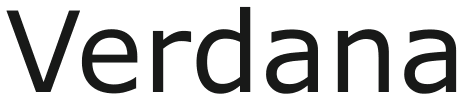
Verdana

Against Verdana: x-height 0.3% taller, 0.3% wider, 2.1% lighter, and 4.1% more stroke contrast.
Letters that differ most from Verdana: I, J, and j.
Styles: 2 weights, with italics.
- ✓Logo
- ✓Selling
- DejaVu Fonts licence
4 of the 24 reach 80 against Verdana.
Which Verdana alternative to pick
Start with DejaVu Sans for Verdana: its score 92 leads these picks, and it is only 0.3% wider, though its ink is 2.1% lighter. For Verdana headings that need more weight choices, Biryani has 7 weights and ink 4.7% darker, while Amiko gives a lighter page than Verdana, with ink 3% lighter and letters 0.3% narrower. DejaVu Sans is the only one of the five with italics and the only one the lab puts no label on against Verdana; it labels Varela and Telex with shorter x-heights. In all five picks the capital I is among the letters that differ most from Verdana’s.
- For Verdana work where average width takes priority, Biryani has no measured width gap, but its lowercase is 1.4% taller and its ink 4.7% heavier; that combination earns 83, below DejaVu Sans at 92 despite the exact width average.
- Varela and Telex each supply only a regular weight for Verdana headings, while Biryani spans 200 to 900; choose the family before planning a hierarchy that needs several weights. Telex shortens Verdana’s average letter width by 7%, but adds 6.2% ink and 8.3% stroke contrast, so fitting a shorter line also changes its texture.
Where DejaVu Sans and Verdana differ
01 / Where the difference shows
I, J, and j: DejaVu Sans parts from Verdana most here
DejaVu Sans keeps Verdana’s x-height within 0.3%; the widest gap is 4.1% more stroke contrast.
The lab puts no difference label on DejaVu Sans against Verdana.
- x-height+0.3%
- Width+0.3%
- Weight−2.1%
- Contrast+4.1%
Every free font measured against Verdana
| Free font | Score | x-height | Width | Weight | Contrast | Letters that differ |
|---|---|---|---|---|---|---|
| DejaVu Sans | 92 | +0.3% | +0.3% | −2.1% | +4.1% | I J j |
| Amiko | 87 | −4.3% | −0.3% | −3% | +4.9% | I j J |
| Biryani | 83 | +1.4% | 0% | +4.7% | −4.3% | Q I 9 |
| Varela | 80 | −6.5% | −4% | +5.1% | −8.5% | t I o |
| Telex | 79 | −5.8% | −7% | +6.2% | +8.3% | C j I |
| Clear Sans | 77 | −6.1% | −11% | +1.2% | −0.6% | C j e |
| Radio Canada | 77 | −5.6% | −7.4% | +5.2% | −3.2% | b j a |
| Prompt | 75 | −12% | −1.8% | +15% | +7.3% | J I j |
| Kufam | 74 | −0.3% | −3% | +2.3% | −1.9% | V W A |
| Kanit | 74 | −13% | −7.5% | +23% | −0.8% | 1 I l |
| Menbere | 74 | +4.5% | −2.4% | +11% | +3% | J q p |
| Inder | 74 | −7.6% | −7% | +7.7% | +13% | 4 l I |
| Sansation | 73 | −6% | −8.5% | +2.6% | +3.3% | B I 4 |
| Encode Sans Expanded | 72 | −0.5% | +1.6% | −9.8% | +2.9% | j J I |
| Amulya | 72 | −7.8% | −6.8% | −9.5% | +6.7% | g I j |
| Zamero Sans | 71 | −8.1% | −5.1% | +22% | −6.3% | l j a |
| Tauri | 71 | +1.6% | −6.2% | +26% | +10% | g I j |
| Lunasima | 71 | −4% | −2.1% | −4.7% | +3.6% | J q j |
| Noto Sans | 71 | −1.7% | −5.6% | −0.5% | +3.3% | J j p |
| Encode Sans Semi Expanded | 70 | −0.5% | −4.8% | −7.5% | +4.8% | j J I |
| PT Sans Caption | 70 | −3.7% | −0.5% | −0.3% | +4.8% | l j Q |
| Martel Sans | 70 | −2.1% | −3.9% | −2.2% | +10% | g I j |
| Maven Pro | 70 | −8.5% | −8.8% | −13% | −8.9% | J b I |
| Guidy | 70 | −4.7% | −1.7% | +4.6% | −5.3% | i l Q |
Verdana or Tahoma
Tahoma is the narrower of Matthew Carter’s two sans serifs here, Verdana the wider. Measured through the 20 free fonts the lab set beside both, Verdana is 15% wider and 10% lighter than Tahoma, with the same x-height and the same stroke contrast. DejaVu Sans, the closest free font to both, shows what that does: it keeps Verdana’s width within 0.3% and scores 92 here, but runs 15% wider than Tahoma, where it scores 88. Use this page when the text you are matching is set in Verdana.
Can I use these Verdana alternatives for…
| Free font | Web | App | Logo | Selling | Commercial | |
|---|---|---|---|---|---|---|
| DejaVu Sans | !* | !* | ✓ | ✓ | ✓ | ✓ |
| Amiko | ✓ | !* | ✓ | ✓ | ✓ | ✓ |
| Biryani | ✓ | !* | ✓ | ✓ | ✓ | ✓ |
- * DejaVu Sans, Verdana alternatives on a website or inside an app: include the copyright notice and licence with the font files.
- * Amiko and Biryani, Verdana alternatives inside an app: include the copyright notice and licence with the font files.
- DejaVu Fonts licence text
- OFL 1.1 text
- Full conditions for Verdana alternatives
Verdana alternatives: questions
What is the closest free alternative to Verdana?
DejaVu Sans scores 92 against Verdana, ahead of Amiko (87) and Biryani (83) among 24 free fonts.
Which Verdana alternative is closest in size?
Biryani matches Verdana’s width most closely (no measurable gap), and DejaVu Sans its x-height (x-height 0.3% taller), of these 5.
How does Amiko differ from Verdana?
Amiko scores 87 against Verdana: x-height 4.3% shorter, 0.3% narrower, 3% lighter, and 4.9% more stroke contrast. Its I, j, and J differ most from Verdana’s.
Which Verdana alternative has the most weights?
Biryani has the most of the Verdana picks here, 7 weights; Amiko has 3 weights, DejaVu Sans has 2 weights, and Varela has 1 weight.
Can I use the Verdana alternatives commercially?
Yes, all 5 free alternatives to Verdana here allow commercial work.
Is Verdana an open font?
No. Verdana ships with Windows 11, Microsoft 365, and macOS Tahoe.
Paid fonts that share free alternatives with Verdana
- Lucida Sans Unicode → DejaVu SansShares DejaVu Sans, Telex, Amiko, and Biryani with Verdana. Lucida Sans Unicode against Verdana: x-height 2.8% shorter, 2.1% narrower, 2% heavier, and 18% more stroke contrast.score 89
- Segoe UI → TASA ExplorerShares DejaVu Sans and Amiko with Verdana. Segoe UI against Verdana: x-height 8.3% shorter, 12% narrower, 0.8% lighter, and 1.6% more stroke contrast.score 84
About Verdana
Verdana is a humanist sans serif that Matthew Carter designed for Microsoft in 1996. Windows 11, Microsoft 365 and macOS Tahoe all ship Verdana, and Windows 11 adds Verdana Pro among its optional fonts.
Besides Verdana, Matthew Carter designed Georgia and Sitka.
Verdana is a font by Microsoft; FontForThat is not affiliated with Microsoft; this is an independent comparison.