Calibri alternatives. Closest free font by our measurements: Asap Condensed, score 93.
Asap Condensed and Asap tie at score 93 as the free fonts nearest Calibri, with Istok Web next at 83 of the 24 we measured.
6 / 6
Score 93 · closest by measurements
Asap Condensed
Sphinx of black quartz, judge my vow
Loading font…
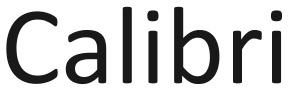
Calibri

Against Calibri: x-height 13% taller, 8.7% narrower, 6.6% heavier, and 2.5% less stroke contrast.
Letters that differ most from Calibri: d, r, and 8.
Styles: 8 weights, with italics.
- ✓Web
- ✓Logo
- ✓Selling
- OFL 1.1
Carlito keeps Calibri’s character widths, and so its line breaks, at score 56.
Which Calibri alternative to pick
Pick Asap Condensed for Calibri when a narrower setting helps: it scores 93 and runs 8.7% narrower, with 8 weights and italics. Asap also scores 93 against Calibri but runs 9.5% wider and offers 9 weights; for a document whose line breaks must stay in place, Carlito has the same character widths as Calibri.
Where Asap Condensed and Calibri differ
01 / Where the difference shows
d, r, and 8: Asap Condensed parts from Calibri most here
Asap Condensed keeps Calibri’s stroke contrast within 2.5%; the widest gap is x-height 13% taller.
The lab labels Asap Condensed against Calibri: x-height 12% taller, 9% narrower, and 7% heavier.
- x-height+13%
- Width−8.7%
- Weight+6.6%
- Contrast−2.5%
Every free font measured against Calibri
| Free font | Score | x-height | Width | Weight | Contrast | Letters that differ |
|---|---|---|---|---|---|---|
| Asap Condensed | 93 | +13% | −8.7% | +6.6% | −2.5% | d r 8 |
| Asap | 93 | +13% | +9.5% | −5.1% | −2.5% | p 9 l |
| Istok Web | 83 | +9.8% | +6.3% | −2.9% | +14% | 7 8 g |
| Beiruti | 83 | −17% | −14% | −0.8% | −7.8% | 1 q d |
| Alpino | 79 | −14% | −6.3% | +5.2% | −0.9% | O F 8 |
| Miriam Libre | 75 | +21% | +20% | −16% | −16% | r I 5 |
| Signika Negative | 75 | +7.5% | +4.8% | +14% | +7.6% | r 4 g |
| Signika | 72 | +7.6% | +5.2% | +19% | +8.3% | r g 4 |
| Zain | 71 | −1.5% | +6.5% | +13% | −13% | 9 a o |
| Nanum Gothic | 71 | +16% | +14% | −23% | −2.2% | O H F |
| Rubik | 70 | +11% | +16% | +1.7% | −1.1% | 9 6 J |
| Pilcrow Rounded | 68 | +14% | −3.4% | −16% | −15% | 1 7 8 |
| M PLUS Rounded 1c | 68 | +11% | +16% | −19% | +3.8% | H g 1 |
| Sofia Sans | 68 | +4.5% | +6.8% | +2.1% | −9.6% | q C G |
| Dosis | 67 | +2.6% | −6.3% | −13% | −14% | Q f 0 |
| Kosugi Maru | 67 | +14% | +9.7% | −3.8% | −9% | m G 8 |
| Libre Franklin | 67 | +14% | +16% | −12% | +10% | 5 B e |
| Sofia Sans Semi Condensed | 66 | +4.3% | +1.5% | −0.2% | −11% | q d G |
| Pally | 66 | +9.3% | +5.7% | +0.4% | −25% | y O g |
| Mandali | 65 | +3.6% | +9.9% | −11% | +12% | o 8 g |
| Gayathri | 65 | +4.6% | +9.4% | −10% | +43% | y Z O |
| Genjyuu Gothic | 62 | +16% | +16% | −5.5% | −0.1% | o 7 e |
| Mitr | 62 | +2.8% | +22% | +24% | +6.3% | 0 a 5 |
| Carlito | 56 | +2.3% | 0% | +0.9% | +5.4% | k O 9 |
Can I use these Calibri alternatives for…
| Free font | Web | App | Logo | Selling | Commercial | |
|---|---|---|---|---|---|---|
| Asap Condensed | ✓ | !* | ✓ | ✓ | ✓ | ✓ |
| Asap | ✓ | !* | ✓ | ✓ | ✓ | ✓ |
| Istok Web | ✓ | !* | ✓ | ✓ | ✓ | ✓ |
- * Asap Condensed, Asap, and Istok Web, Calibri alternatives inside an app: include the copyright notice and licence with the font files.
- OFL 1.1 text
- Full conditions for Calibri alternatives
Calibri alternatives: questions
What is the closest free alternative to Calibri?
Asap Condensed scores 93 against Calibri, ahead of Asap (93) and Istok Web (83) among 24 free fonts.
Which free font keeps Calibri’s line breaks?
Carlito, drawn to Calibri’s widths, so documents keep their lines and pages; it scores 56, with 5.4% more stroke contrast the largest gap against Calibri.
How does Asap differ from Calibri?
Asap scores 93 against Calibri: x-height 13% taller, 9.5% wider, 5.1% lighter, and 2.5% less stroke contrast. Its p, 9, and l differ most from Calibri’s.
Which Calibri alternative has the most weights?
Asap has the most of the Calibri picks here, 9 weights and italics; Asap Condensed has 8 weights, Beiruti has 8 weights, and Alpino has 6 weights.
Can I use the Calibri alternatives commercially?
Yes, all 6 free alternatives to Calibri here allow commercial work.
Is Calibri an open font?
No. Calibri ships with Windows 11 and Microsoft 365.
Paid fonts that share free alternatives with Calibri
About Calibri
Lucas de Groot designed Calibri for Microsoft in 2007, a humanist sans serif.
Besides Calibri, Lucas de Groot designed Consolas.
Your device may list Calibri as Calibri Light; the preview above looks for the font under that name too.
Calibri is a font by Microsoft; FontForThat is not affiliated with Microsoft; this is an independent comparison.